PROJECT OVERVIEW
Just south of Stockholm, Heron City opened in the early 2000s as one of Sweden’s first entertainment centers. It’s a destination for movies, bowling and family fun rather than traditional shopping. But over the years, visitors dropped, attractive tenants left and competition grew. The energy was gone.


OUR APPROACH
Balder, the new owner, saw potential. Rather than rebuilding from scratch, the ambition was clear: to reverse the decline and make Heron City a true destination again.
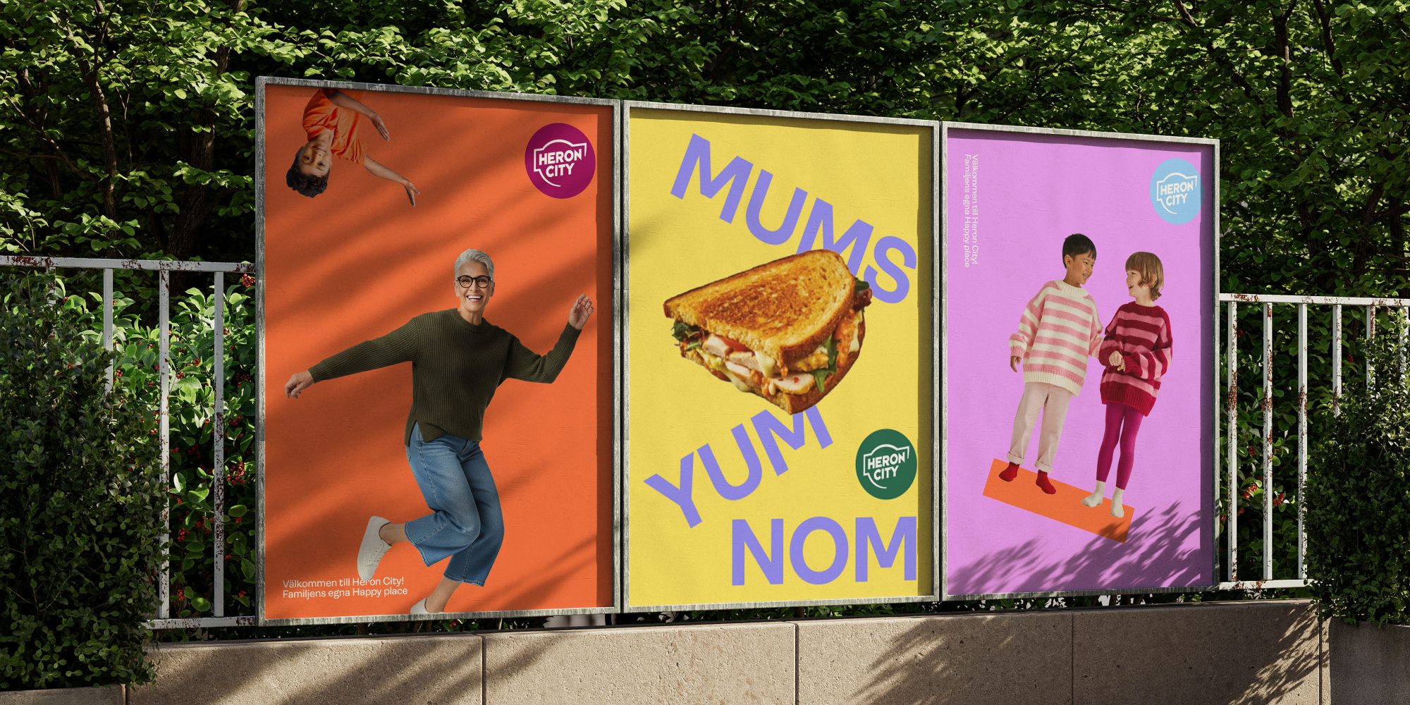
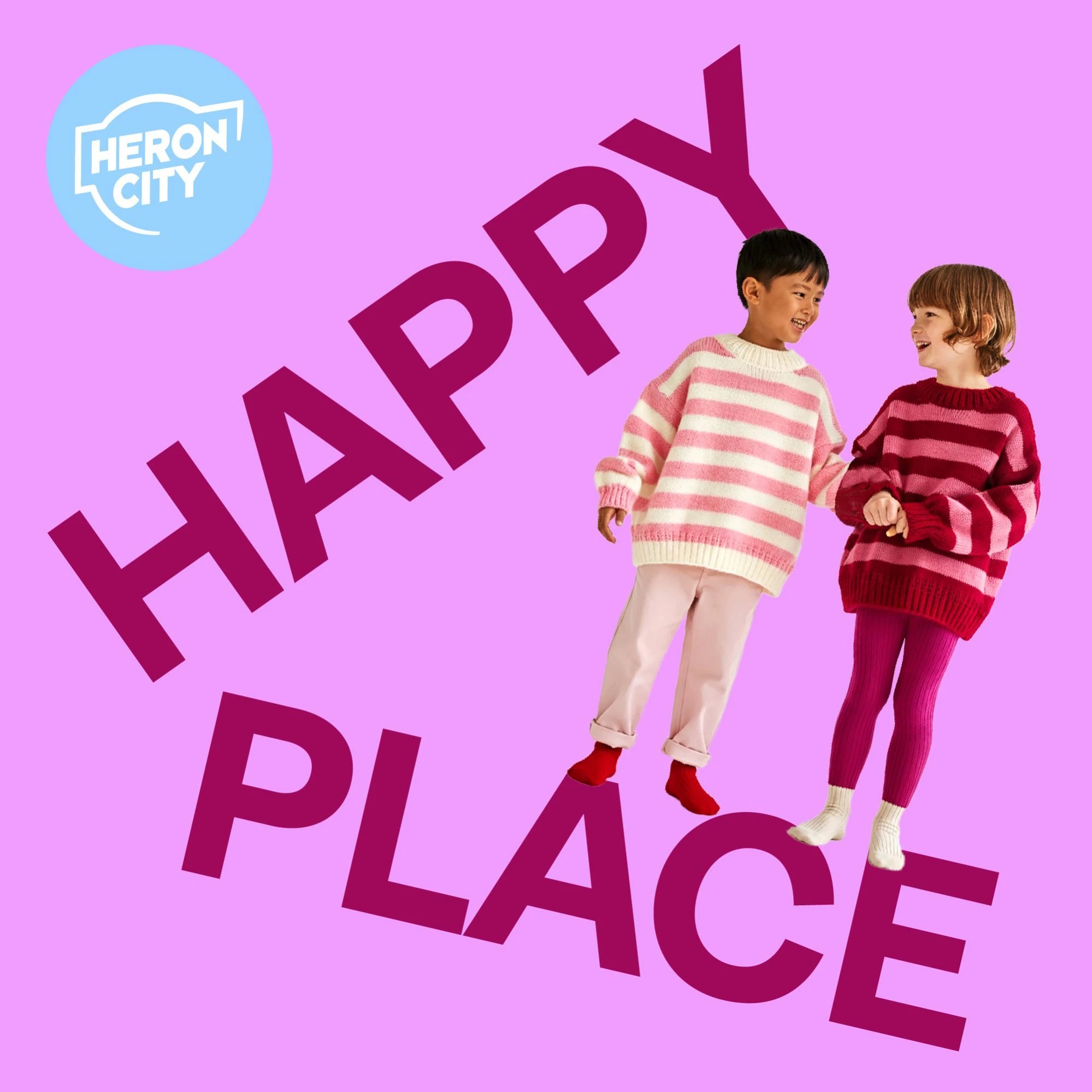
Our idea was to go back to the roots and reframe the brand around what it was always meant to be: The Happy Place. A destination where families feel entertained, welcome and cared for.
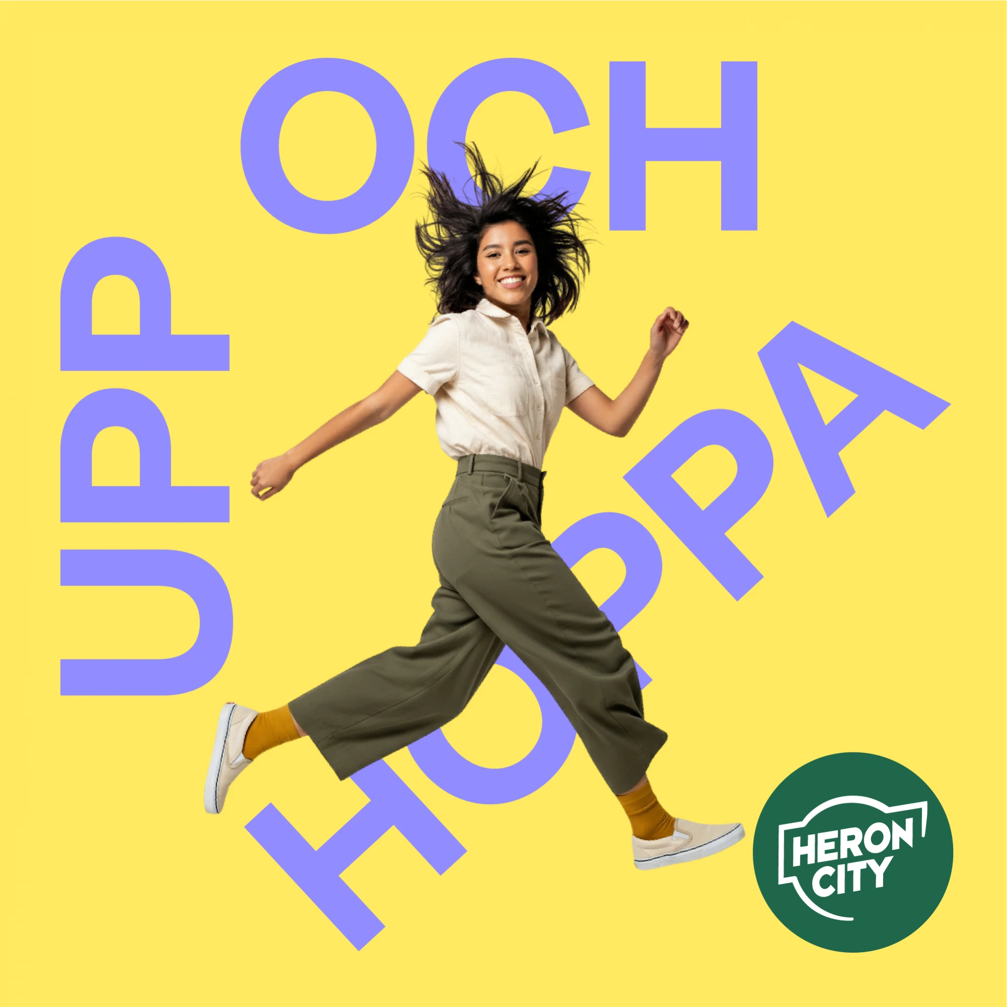
Instead of smoothing over the quirky architecture - the half floors, the crisscrossing bridges, the escalators in every direction, we embraced it. Those odd angles became the inspiration for a new visual identity that is energetic, colorful and full of play.
THE RESULTS
The new identity is just as playful and welcoming as the experience itself. The logo bursts like confetti. The bright and bold color palette radiates joy. Typography moves at sharp diagonals. Imagery is cut-out and collage-like, and patterns animate both communication and physical space. The result is an identity that doesn’t try to hide complexity but turns it into character. Simplify to Clarify here meant removing what was heavy and outdated, and amplifying the core of the Heron City brand: joy and warmth.